

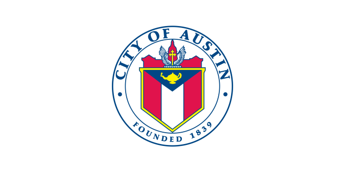
Seal originally created in 1916, inspired by Stephen F. Austin family coat of arms
The capital city of Texas has announced an official brand redesign and logo to be the town’s new symbol, saying that the existing city seal that features a cross “does not promote the City’s distinctive values and mission.”
Austin City Manager T.C. Broadnax unveiled a new brand logo for the city Thursday, a move that he said is aimed at unifying both the city’s brand identity and its people.
“For the first time in Austin’s history, we will have a logo to represent the city services and unify us as one organization, one Austin,” Broadnax told reporters.
Broadnax revealed the new Austin logo, which features the letter “A” in the shape of two rolling hills — imagery, the city said, is “more than just a letter” — with blue and green “flowing lines that echo the movement of our rivers, the curves of our hills, and the dynamic energy of Austinites.”
Officials say the city partnered with Austin-based creative agency TKO and Pentagram, an international design firm named after a five-sided star symbol which, at least among Christian communities, has traditionally been linked with satanism and the occult.
As of Friday afternoon, the seal remained on the city’s website and other digital assets.
The old city seal — which Broadnax said was used in place of an official Austin logo — featured a coat of arms from the family of Stephen F. Austin, the city’s namesake and the so-called “Father of Texas,” who led efforts to colonize Texas in the early 1800s. Austin, whose father received a grant from Spain to settle Texas before he died, brought 300 families and their slaves from the eastern U.S. to the Tejas region of the former Mexican territory in 1825.
The Austin coat of arms upon which the old logo was based included a crest with a gold Latin cross with white wings set against a backdrop of a silhouette of the Texas State Capitol.
According to officials, the city seal was created in 1916 by a San Francisco illustrator for a flag design contest.

In 2018, the Austin City Council voted to prioritize the development of “a cohesive brand” for the city, including a redesign of the logo. The new-look Austin “brand” will officially launch on Oct. 1, with updated digital assets including the City of Austin website, department web pages, social media profiles and email newsletters.
Broadnax said the move was made in part because officials say residents weren’t satisfied with the city seal.
“Through community feedback sessions, we learned that a large majority of Austinites don’t have recognition of or a strong affinity for the city seal, which has been used in place of a logo,” he said.
After conducting “surveys and focus groups with a wide array of community members,” Broadnax said it was clear residents wanted a “modern government that reflects the community’s values and is consistent, connected, and responsive across departments and services.”
“And that’s what this brand does,” he added.
The inclusion of the Latin cross on the former Austin flag became the subject of a 1987 lawsuit by an atheist group identified as the Society of Separationists, which claimed the Christian insignia violated both the Texas and U.S. Constitution.
A U.S. appeals court dismissed the suit in 1991, saying the cross was a recognition of Austin’s family coat of arms and was not a government endorsement of any religion.
City spokesperson Erik Johnson told The Christian Post that the city seal is “not a brand, and does not promote the City’s distinctive values and mission.”
“The seal will not go away, but the new brand and logo reflects Austin’s growth over the last century and what it represents to its residents,” Johnson added.
The initiative comes on the heels of a disastrous rebrand of Cracker Barrel Old Country Store, which backed off from a planned logo redesign amid a negative public relations firestorm that drew accusations of “wokeness” and the attention of President Donald Trump.
The company’s initial announcement that the country-style eatery would be removing the famous “old timer” Uncle Herschel figure and whip-like “K” from its logo, which had been in place since 1977, sent shares plummeting before recovering after the decision to keep the old logo.


